Really rough outline of the book. Quickly sketched pictures and no text yet. I have started work on the actual pages, but they are still PSD files so you will just have to wait until they are done. So thats it for this week.


Right now I planning on creating a graphic novel, but because of time I plan on making more of a prologue to a longer story. My idea is to create and set up a back-story of science fiction universe. I will be using a Spastle theme, which is a combination of space and castle, basically a meshing of both science fiction and fantasy. Knights riding rocket horses and cyber dragons, what’s not to love? The dimensions will be about 8 x11 inches or similar. The plan right now is to have it production ready in InDesign. I will draw the images in Photoshop though I might use photographs with filters as backgrounds. It will include both text and images like a comic book. I’m planning on going solo with this project.


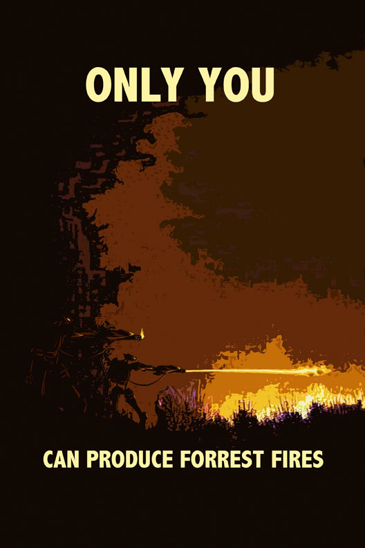
I know we were only supposed to do two posters, but I miss read the assignment at first and originally did the two movie posters. I couldn’t decide which I liked better so I decided to post them both. As for the propaganda posters, when I was brainstorming the second half of the assignment and I came up with both ideas and liked them so I decided to do both. The two themes I chose were the movie posters and the Propaganda posters. I didn’t choose to make a music poster because these had to be for things that didn’t exist and I didn’t want to over think the process of making a poster for music I’ve never heard before, that’s hard enough to do for music you have listened too. Both movies and propaganda are very visual while music is more in your mind. Some compositional techniques I used to catch someone’s attention were to use zigzags, asymmetry, and contrast. The two movie posters I wanted to instill a sense of mystery with the images by either altering the image to either be really washed out and light with a few dark areas to give some details, but not enough. Also by going in the opposite direction and darkening the image so that it is almost a silhouette. The propaganda posters were more of a dark humor. The images themselves are very imposing while the text plays off some recognizable phrases twisting them to mean something very different.


Flat colors are in some ways easier and in some ways harder then working with continuous tones. First of all they are just simple shapes each their own color and you don’t have to worry about shading and shadows to make everything look realistic because it will never look realistic. I find it to be easier also because there are fewer variables involved and it takes less time. However that fact could be somewhat of a downside because it does limit the final outcome. There were a few occasions where I wanted to add shading but I couldn’t. Also because they are composed of many shapes it takes lots of planning to get the right look of something you want. You have to plan out the shape of the individual colors before-hand. Colors weren’t necessarily planned. I used a lot of grey and blue in two of my images but the final colors often were not the same colors I started with. Once I had got most of the image done I went back and adjusted the different colors until I found something I liked. Some color combinations do work better than others. Black and yellow always look good together, but pink and a sort of brownish green, not so much. I didn’t really go out of my way to look for colors that contrasted as long as they looked good together. Most of the colors I used were similar to each other with a few colors in the image that stood out to offset the majority.


Working on the collages was an interesting experience. I did not have any sort of plan going in I let them sort of evolve and form on their own. I skimmed through images online until I would come across an interesting looking image and then I would bring it into Photoshop. Once I had about six or more I sort of had an idea of what I wanted to do with each and I began to manipulate them. I did not use all the images I deleted the ones I did not think I would need. The only thing I really planned was to erase the parts of the photos that didn’t belong really well so it all looked like one image. The one thing I really tried for was to make the collages look like a single image rather than a mash up of multiple ones. Once the collage was well under way, I would sometimes get ideas to add specific things and I would go looking for more specific images. Were the collages ever unsettling? Not really I don’t think. Sure they were strange, but I don’t think I ever found them unsettling. Both images turned out very different from each other and what I was expecting them to be. For each I focused on different techniques one was mostly changing the opaqueness and the other was more about piecing the different parts together. Multiple pictures with different opacities have a very different feel to it when you look at it, almost like ghosts of different events of something.


My experimentation with fonts on this assignment was rather minimal, I scrolled through and looked at the selection available until I found one that looked interesting to me, but that was about the extent of it. For the most part though I just picked a typeface I liked and went with it. I wanted to let the style of the font dictate the final design image. I didn’t really do any experimentation too much beyond that though. I feel some advantages were that I needed less time to get started and start manipulating the letters themselves and that I was able to focus more on the design of the image rather than the individual components . As for disadvantages I guess I would say that there are many other designs that I haven’t thought of because I didn’t experiment very much. I don’t have any personal connection with the letters I chose them mostly for their shape. I did a little planning for a few of the images so I had already decided on a letter that would be best suited for the design. I did not resaturize my letters to manipulate them. I wanted the letters to be as smooth as possible without any of the blockyness that would be a result of over manipulating an object in Photoshop. So I kept them as text so that they would remain vector objects. This was somewhat cumbersome when there were many copied layers; I believe one image had over seven hundred layers when done.

